Introduction
Claude Design is transforming the workflow of AI-generated interfaces. This tool not only automatically extracts complete design systems from screenshots, code, or Figma files but also evolves from ‘human-written prompts for AI’ to ‘AI understanding and generating on its own.’ This article delves into three practical cases, analyzing how to combine System Prompts, Skill specifications, and a three-tier design system to produce professional and aesthetically pleasing product interfaces.

What is Claude Design?
On April 16, Anthropic launched a new product alongside Opus 4.7: Claude Design. Currently in the Research Preview phase, it is available for Pro, Max, Team, and Enterprise plans.
Claude Design is an AI-native design tool. The left side features a chat interface, while the right side is a canvas. You describe your needs in natural language, and it generates editable high-fidelity interfaces directly.
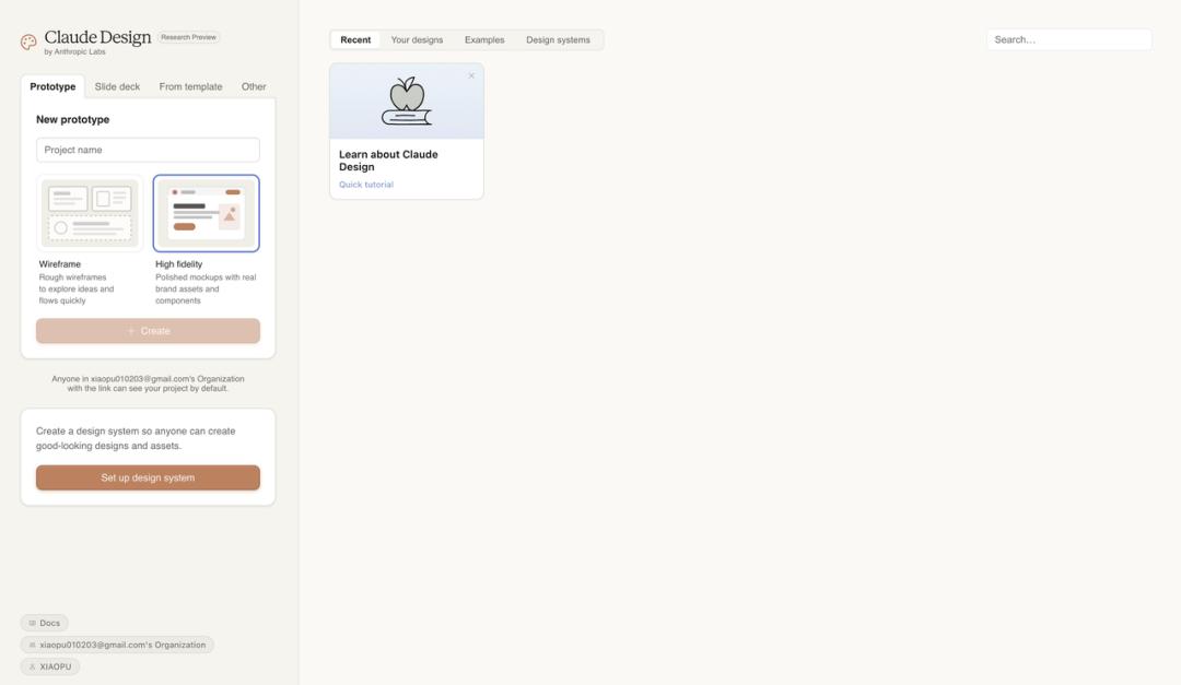
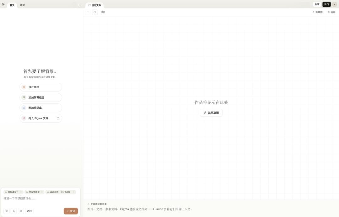
When creating a project, you can choose between Wireframe or High Fidelity modes. After entering, the left side is the chat area, and the right side is the canvas. You can also add context to the project, such as screenshots, code repositories, or Figma files, and Claude will use these materials to understand your requirements.
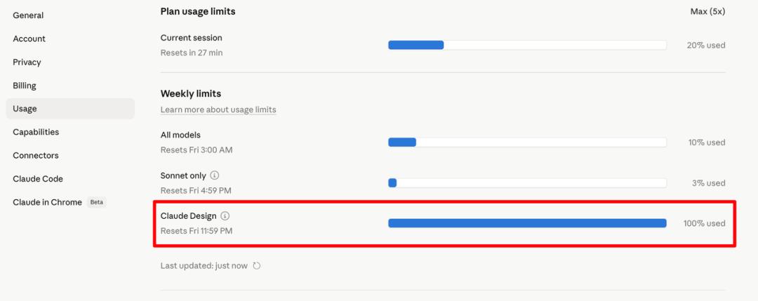
However, it’s important to note that it consumes tokens quickly. Claude Design’s usage is calculated separately from regular conversations and Claude Code. After running three cases in one day, my quota was maxed out at 100%.
After several months of product development, I’ve discovered a pattern: to ensure AI consistently produces high-quality outputs, it’s not just about writing good prompts each time but rather establishing standards for it to follow.
Three-Tier Architecture
First Layer: Project-Level Guidelines (System Prompt)
The System Prompt, or Instructions, governs the overall project. It defines what the project is about, who the users are, the boundaries and constraints, and the overall tone and style.
For my AI mock interview product, the System Prompt specifies: you are an interviewer who must generate questions based on the candidate’s resume and target position, detailing your questioning logic and what you must absolutely avoid. Once these rules are established, all subsequent conversations operate within this framework.
The System Prompt acts as the constitution of the project, eliminating the need to repeatedly inform the AI of your identity and objectives. Set it once, and it applies globally.
Second Layer: Specific Action Guidelines (Skill)
Having a System Prompt is not enough; it governs the overall but not the details.
For instance, if you ask the AI to write a PRD, it knows what the product is and who the users are, but it doesn’t know what the PRD should look like. Font sizes, structure, whether to include competitor analysis, and the granularity of technical specifications must be defined. Without constraints, each output could vary.
This is where Skills come into play. A Skill is a detailed standard for a specific action. It doesn’t manage the overall project but focuses on one task in great detail.
I have developed several Skills: for writing PRDs, creating Xiaohongshu graphics, and making presentations, each refined through practical use. For example, my PRD Skill includes granular rules like avoiding dashes and using italics for emphasis.
The more detailed the Skill, the more consistent the AI output becomes. This is akin to training a new employee: providing a detailed SOP results in more reliable work than vague verbal instructions.
Third Layer: Design System
The first two layers address what to do and how to do it, while the third layer focuses on the aesthetics of the output.
When you ask the AI to write code or create interfaces, it can produce functional outputs. However, without aesthetic standards, the results may lack coherence in style, color, and overall appeal, leading to random outputs.
Previously, the approach was to manually create a design specification to feed to the AI. Google Stitch introduced the concept of DESIGN.md, where design systems are written in markdown and placed in the project root directory for the AI to reference before generating interfaces.
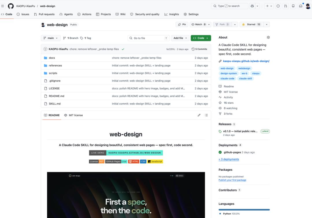
I also developed a web-design Skill that does this: first establishing design specifications, then writing code. The design specifications include five sets of preset design tokens, each with complete color, font, spacing, and border-radius rules. I even open-sourced this Skill on GitHub just before the launch of Claude Design!
While this direction is correct, manually creating this document is tedious, especially when extracting specifications from an existing design draft requires measuring and testing repeatedly.
Claude Design automates this third layer, transforming manual work into automation.
Together, these three layers form the complete infrastructure I now use to develop products with AI: System Prompt for planning, Skill for specifications, and Design System for aesthetics.
Case Studies
Case 1: From Screenshots to a Complete Landing Page
For the first test, I simply wanted to see what could be achieved with minimal input.
I found a website, took a few screenshots, and uploaded them without any settings, letting Claude work on its own.
Upon receiving the screenshots, Claude first summarized its understanding of the design language: color schemes, font choices, key elements, and layout logic. It then broke down the process into seven steps, from file structure to page components.
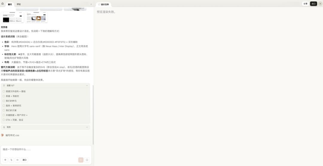
The preview rendering failed because it couldn’t load my uploaded screenshots, which felt like a bug. However, it didn’t affect the outcome, so we can look at the results:
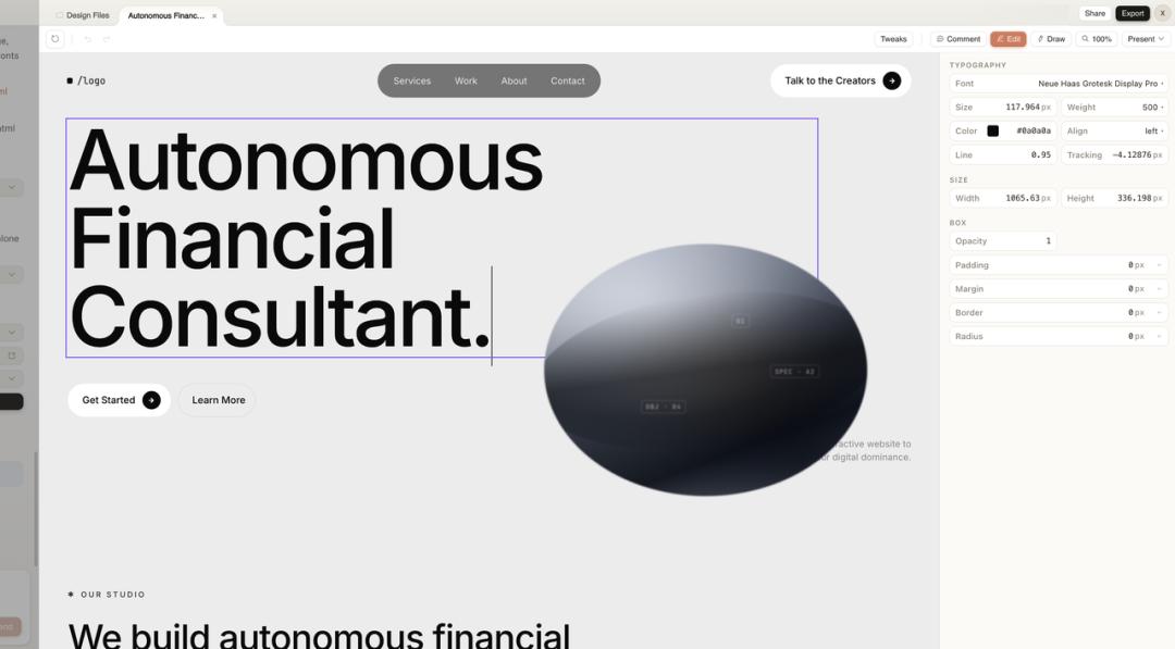
A complete landing page was generated. It featured monochrome colors, bold typography, a navigation bar, hero section, service introduction, and CTA buttons, all present. The selected font, weight, and spacing were not random; they effectively captured the essence of a high-end agency website.
Two features deserve special mention:
-
Visual Editing: The generated page is not an image but an editable HTML. Clicking any element brings up a properties panel on the right where you can adjust font, color, and spacing directly. This essentially functions as a lightweight Figma editor.
-
Annotation: If you find an issue, you can draw a circle on the canvas, add a note, and send it to Claude for adjustments. A record of your actions is displayed at the bottom. This mimics the review experience between designers and developers, with AI on the other side.
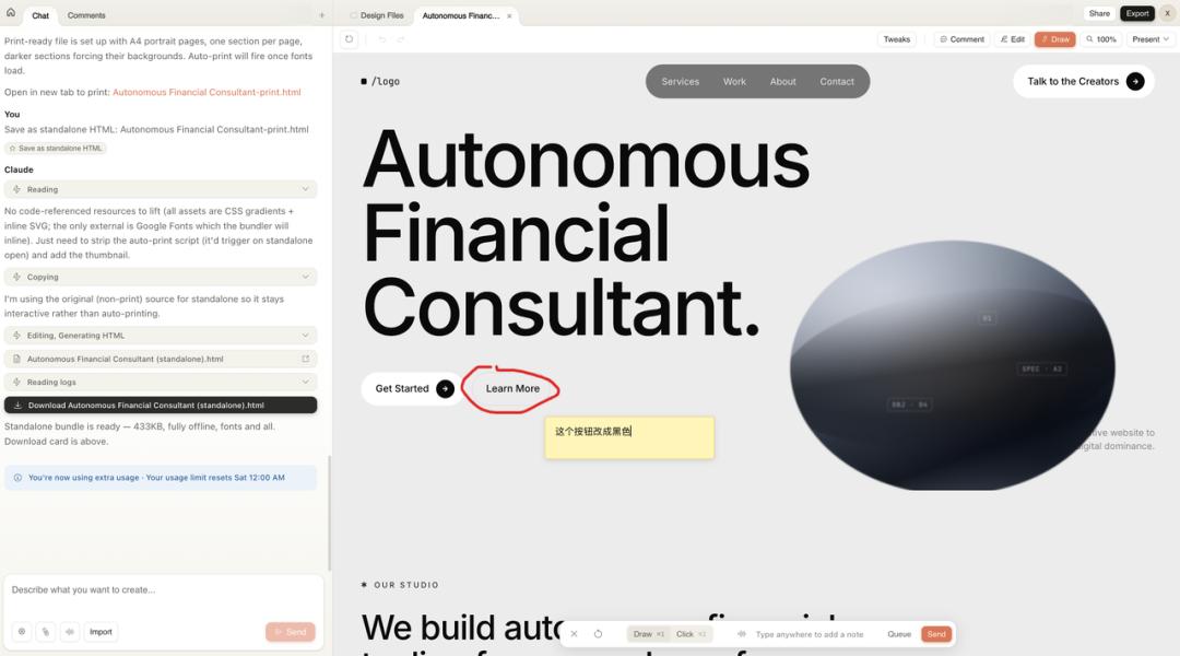
Finally, you can export the page as an independent HTML file, fully offline, ready for deployment. It also supports formats like PDF, PPTX, and can hand off to Claude Code for further logic development.
After completing the first case, my impression is that the structural restoration is indeed strong. Layout, components, and typography were all on point. However, the generated images were CSS placeholders; the kind of textured 3D effects cannot be achieved through code alone. This can be easily remedied by providing it with replacement materials.
Case 2: From Figma Template to Design System
In the first case, I didn’t use a design system; Claude relied solely on screenshots. For the second test, I wanted to see what the design system could achieve.
My approach was to find a visually appealing design template in the Figma community, extract its design style into Claude Design’s design system, and then use this system to migrate my existing presentation materials.
I selected a PPT template from the Figma community featuring warm gray tones and ink texture imagery, creating a clean overall style.

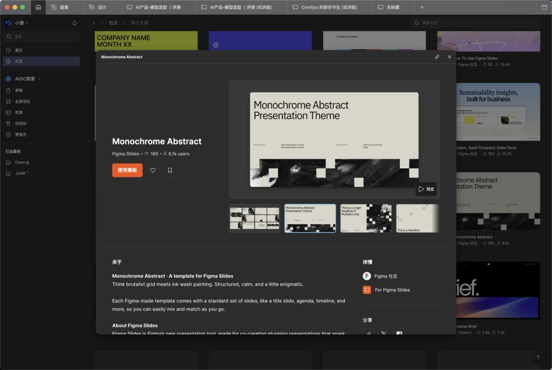
After selecting, I clicked to use the template in Figma and exported the file as a .fig format. There’s a caveat: due to version issues, some Figma exports may actually be in .deck format, but Claude Design requires .fig files.
However, it’s simple; just manually change the file extension to .fig, and it still works!

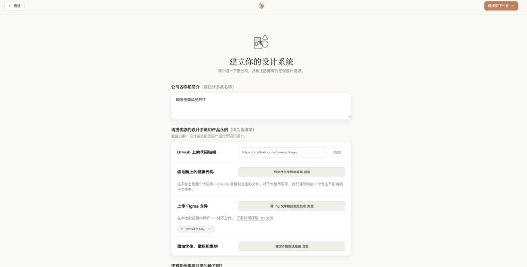
With the .fig file in hand, I returned to Claude Design and uploaded it to create the design system.
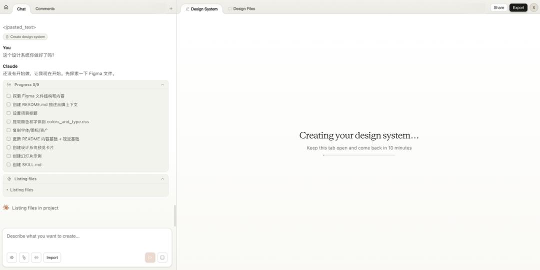
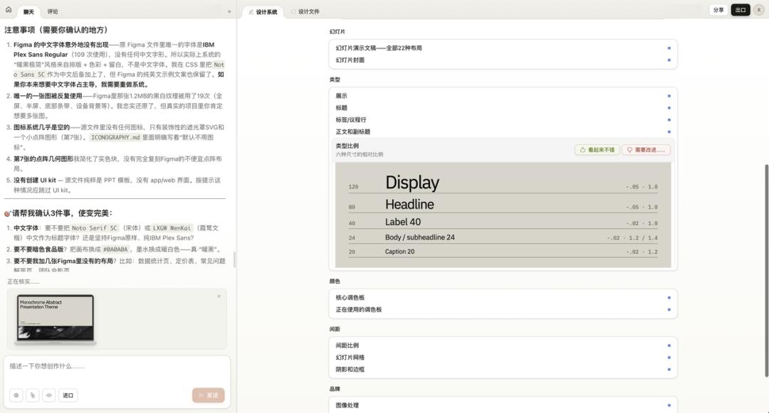
Next, I waited. Claude took about 10 minutes to parse the entire Figma file. It extracted details such as the core color palette, font ratios, spacing rules, slide layout types, and image handling methods, all presented in a structured manner within the design system panel.
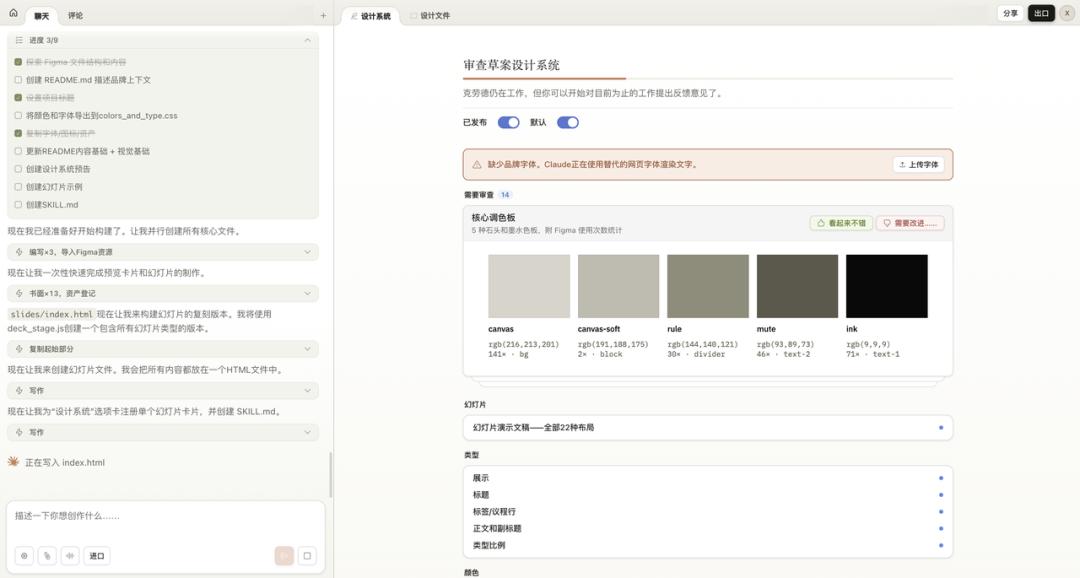
Moreover, it proactively listed several questions for confirmation: for instance, the original Figma file lacked Chinese fonts, so it added alternatives; it noted that only one black-and-white texture image was reused; and the icon system was almost empty. It highlighted these details for you to decide whether to adjust.
After building the design system, it was time for the main event.
I uploaded a previously created HTML presentation and instructed Claude: this is my earlier presentation, help me update it to the Warm Monochrome style.
Claude first read the presentation content and design system, then broke it down into a three-step task: copy design system resources, rebuild the presentation in the new style, and validate the delivery.
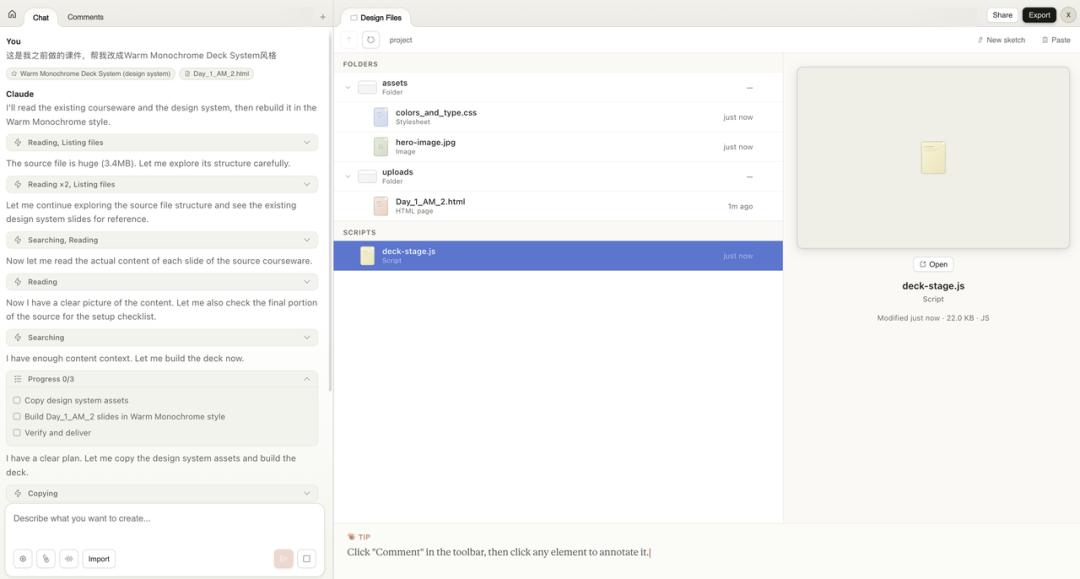
The results were impressive. The content of my original presentation was fully retained, but the visual style changed entirely: fonts, colors, texture backgrounds, and every page adhered strictly to the design system’s specifications. Moreover, it was directly editable, allowing for text changes and spacing adjustments.

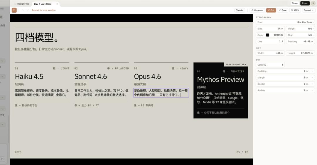
Consider the implications of this capability: it treats the design system as a skin. Any content fed into it can adopt this layer. In the future, changing presentation styles will simply involve switching design systems.
You can now experiment with multiple design systems of different styles—Xiaohongshu style, minimalist PPT style, iOS bento box style—allowing you to choose one for any project. This ensures a high degree of output style consistency.
This is the true appeal of Claude Design.
Case 3: A Complete App Prototype with Multiple Interfaces
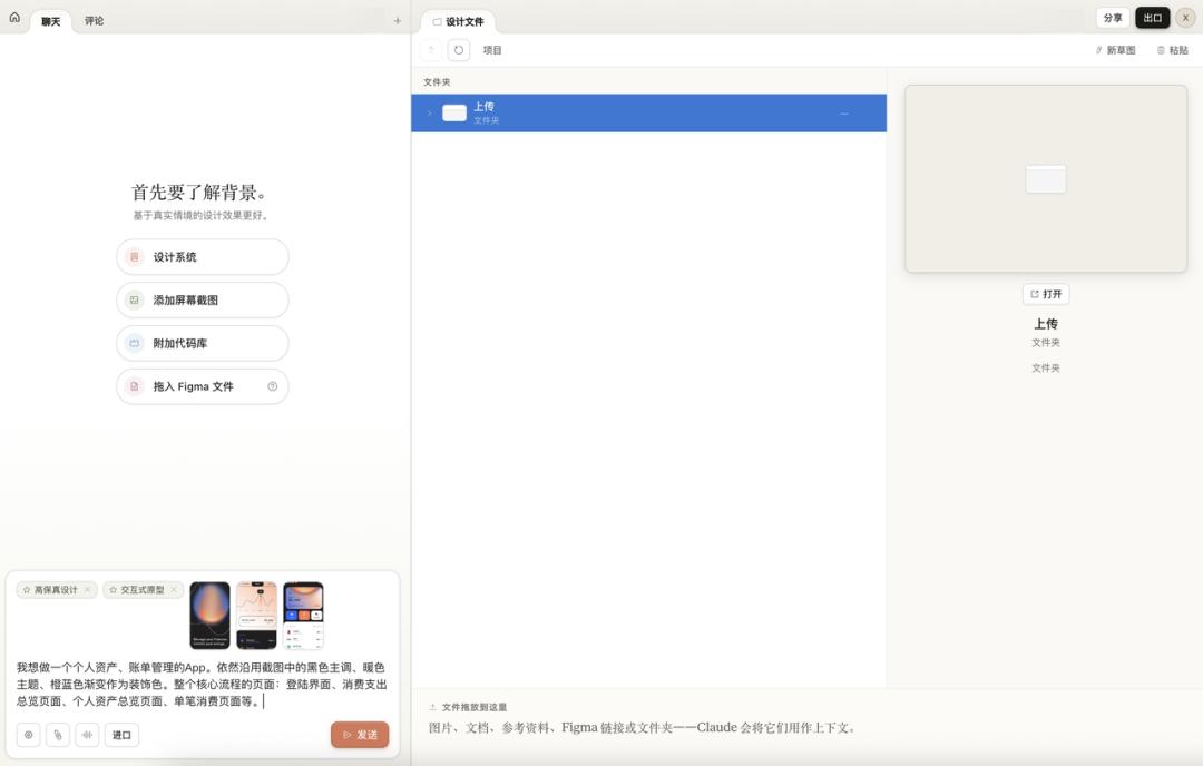
The first two cases tested webpage generation and design systems. For the third, I wanted to go big: create a complete app with multiple interfaces, processes, and interactivity.
I gathered several screenshots of a dark-themed financial app as references and instructed Claude: I want to create a personal asset and bill management app with a black main tone, warm color themes, and orange-blue gradients as decorative colors. The core processes include a login screen, total spending overview, personal asset overview, and individual transaction pages.
Upon receiving the instructions, Claude first established its design system: base colors, accent colors, fonts, patterns, and the number of screens, then began designing screen by screen.
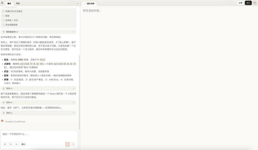
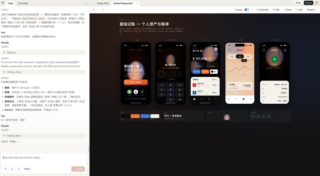
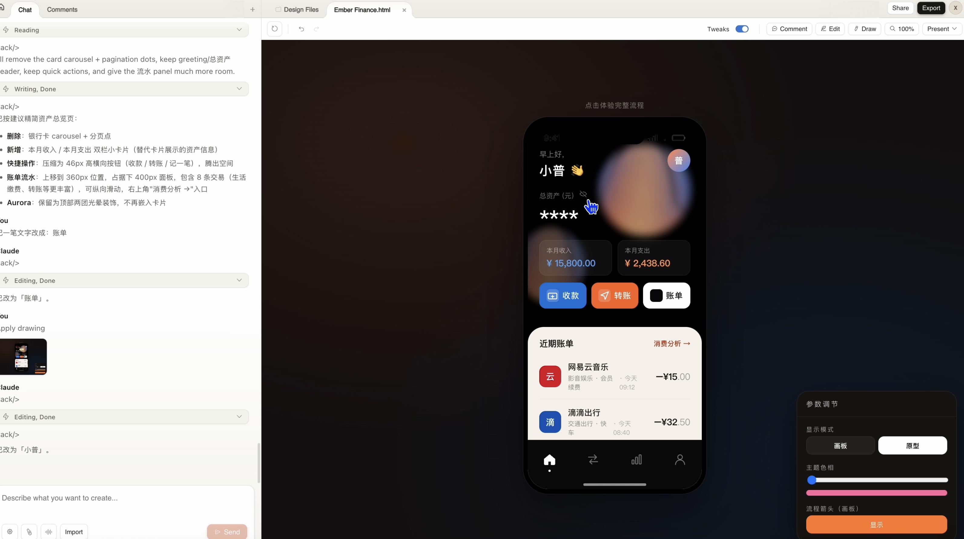
There was a rendering failure in the middle. However, after the second round, wow, five complete interactive screens were laid out on the canvas: welcome page, password login, asset overview, spending analysis, and individual transaction details. Each screen is an independent component, and clicking on any phone icon allows you to enter prototype mode for individual viewing.
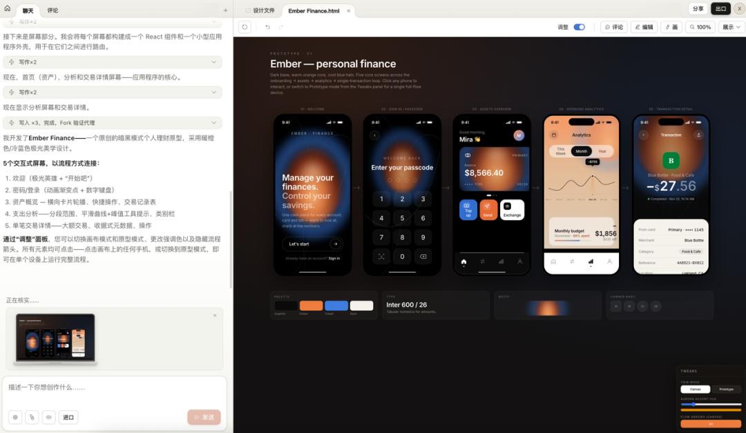
At the bottom, there was a summary of the design system: color palette, fonts, pattern styles, and border-radius rules, all clearly presented.
However, the initial version had a bug: the monthly budget amount on the spending analysis page exceeded the card boundary. I drew a circle on the canvas to annotate the issue.
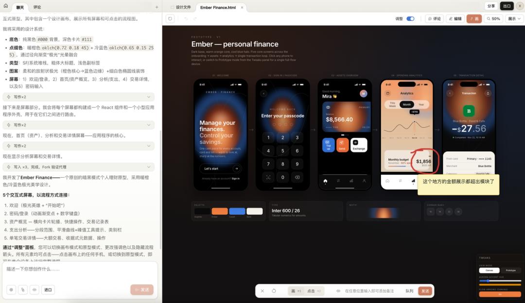
Upon seeing the annotation, Claude identified the problem, adjusted the container spacing and font size, and fixed it.
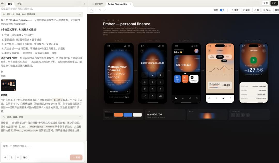
Next, I did something even more interesting: I instructed it to translate the entire app into Chinese.
I asked it to replace all English content with Chinese, change the username to Xiao Pu, the location to Chaoyang District, Beijing, and switch the font to PingFang/Siyuan Black. It searched and edited each file, even changing the avatar character to “Pu.”
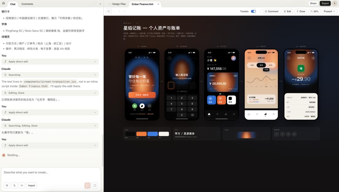
The result was a complete Chinese financial app prototype named Star Flame Accounting, with all five core pages in place.
However, a problem arose.
The welcome page’s background was generated by Claude using CSS gradients, creating that orange-blue glow effect. While it looked decent, it lacked the quality of a truly refined design, giving off a plastic vibe. This is where the limitations of code-generated visuals become evident.
So, I created a breathing effect material with an orange-blue gradient using Lovart, removed the black background, and replaced it in Claude Design.
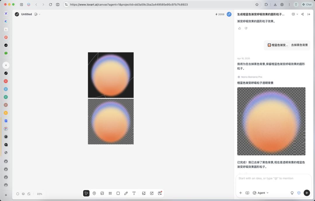
After the replacement, the glow effect finally had an organic quality, no longer resembling a purely code-generated gradient.
I then instructed it to remove the card carousel from the asset overview page and directly display recent transaction details, compressing quick actions into a horizontal button group. The overall information density and usability of the page improved.

After completing this case, my core judgment is that Claude Design excels at structural elements: layouts, components, interactive processes, and multi-screen connections. However, for qualitative materials like organic light effects, 3D textures, and hand-drawn patterns, code generation has its limits. The correct approach is a combination: Lovart for materials, Claude Design for structure and interaction, and annotations for fine-tuning.
To be honest, the background egg still looks ugly, resembling a beauty blender. But I ran out of time for optimizations, as this is a long process of fine-tuning, and I had exhausted my quota!
However, aside from the visuals, you can switch to interactive mode to test directly, not just generating a few static pages:
Conclusion
After running through three cases, I return to the initial statement: refine instructions, develop Skills, and build design systems.
This is not just a concept; it’s a methodology I’ve derived. These three layers are not isolated; they are nested. The System Prompt is the outer shell, Skills are the gears inside, and the Design System is the paint on the gears. Without any layer, the AI output will lack stability.
My workflow for starting a new project is now as follows: first, spend half an hour writing the System Prompt to clarify the project boundaries and rules. Then, identify the specific actions needed for the project—PRD, interface, copy, data analysis—and check if there are existing Skills for each action. If not, I create a new one. Finally, if the output involves UI, I establish a design system to attach.
Once this process is familiar, efficiency increases significantly. Most specifications can be reused, and the Skill and design system libraries will grow thicker. When starting new projects, many elements can be directly mounted without starting from scratch.
Of course, Claude Design is still in Research Preview, with many issues. Rendering can fail, inline comments may occasionally disappear, and token costs are exorbitant, with three cases maxing out my weekly quota. However, it has productized the concept of design systems, which is a step in the right direction.
In the future, the workflow for projects will likely look like this: build your design system library, attach it to projects, and then use dialogue-driven generation. Delegate structural elements to AI, use external tools for qualitative materials, and finally annotate for fine-tuning.
Refine instructions, develop Skills, build design systems. In the AI era, focus on these three tasks daily.
Comments
Discussion is powered by Giscus (GitHub Discussions). Add
repo,repoID,category, andcategoryIDunder[params.comments.giscus]inhugo.tomlusing the values from the Giscus setup tool.