
I spent a week building a data visualization and analysis dashboard for the Philippines 2025 National Demographic and Health Survey (NDHS). This report, released every three years, tracks key indicators related to health, fertility, demographics, and cultural attitudes. The survey, published by the Philippine Statistics Authority (PSA) at the end of March, contains rich data that is valuable not only for journalists but also for policymakers and citizens.
However, more than a month after its release, most news coverage about the report focused on a single data point: the total fertility rate in the Philippines has dropped to 1.7, below the replacement level. While this is significant national news, the survey includes a wealth of other valuable and interesting data on fertility, maternal healthcare, contraception, child mortality, vaccination, discipline and punishment, early childhood development, and intimate partner violence. The data in the survey can be further explored to provide insights useful for journalists, policymakers, and social advocates in various fields.
Through this project, I aimed to make the data more accessible to the audience through maps, charts, and even AI-generated insights, allowing them to delve deeper. Here’s what I learned while vibe coding this dashboard over the course of a week.
1. Patience
Even if you don’t know where to start, you can create building blocks, but it requires a lot of patience.
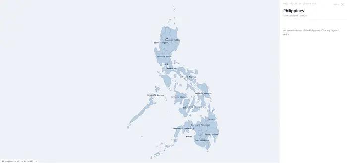
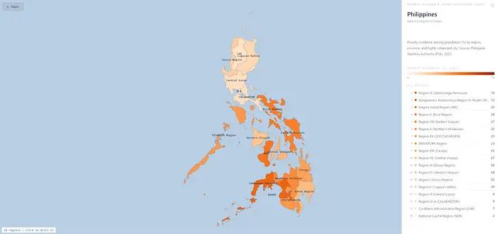
The drill-down map of the Philippines built with vibe coding.
When I started this journey, I didn’t plan to build the NDHS dashboard. I just wanted to experiment with programming agents to create cool maps.
James Faeldon, a developer from the Philippines, maintains a GitHub repository of administrative maps of the Philippines, allowing anyone to build a drill-down map from regions to provinces to cities/municipalities down to barangays (the lowest level of government in the country). I wanted to use his work for my project, but I lacked the programming skills to piece it together until programming agents emerged.
While planning the project in Claude Code, I simply provided the repository address and described the behavior I wanted: it had to load the entire map of the Philippines divided by regions. Clicking on a region would display the provinces within that region, and clicking on a province would show the cities and municipalities within that province. I also needed a data panel that would display information at each level.
The activity started impressively, with Claude Code reading the files from the GitHub repository and building a site similar to what I had imagined in about an hour.
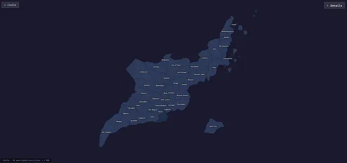
The map of the province of Ilocos Sur built with vibe coding, with the location of Ilocos City offset.
Nevertheless, I ended up spending an entire day adjusting everything. The issues I encountered seemed minor but required knowledge of how local government in the Philippines is organized. For instance, some cities are classified as Highly Urbanized Cities (HUCs), geographically belonging to a province but politically independent of the provincial government. For example, Ilocos City is politically not part of Ilocos Sur, even though it geographically belongs to the province. In practice, this meant that the map for Ilocos Sur did not render Ilocos City, which might make sense politically but not for users.
Even after providing Claude Code with a list of highly urbanized cities, it still struggled to render the map correctly. Repeatedly, it would place cities in the sea, far from their respective provinces. Other times, it rendered HUCs as mismatched pieces in a puzzle.
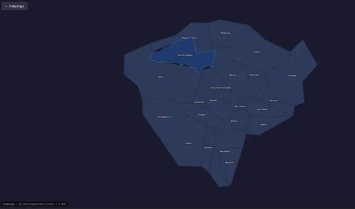
The map of Pampanga province built with vibe coding, highlighting Angeles City.
The process of adjusting everything meant a lot of back-and-forth debugging with Claude Code as it attempted to fix the errors I identified. Several times, my Claude account hit its usage limit, meaning I had to take breaks and wait for the limit to reset before continuing.
Working with the programming agent reminded me of that old programmer joke: “The first 90% of the code takes 90% of the development time. The remaining 10% of the code takes another 90% of the development time.” This proved true repeatedly throughout the project.
But I eventually got the map to look acceptable, even if not perfect. Realizing that I and others could use this as a building block for other data visualization projects, I had Claude upload the project to GitHub. This is a working demo.
2. Magic
Using programming agents for data cleaning and extraction feels like magic.
After publishing my drill-down map template on GitHub, I wanted to use it to handle various datasets. I launched a new project in Claude Code to create a website showcasing different statistical maps to represent various datasets from the Philippines.
I browsed the PSA website to see what geographically granular datasets were available. In the Philippines, obtaining data from the government means searching through slow-loading websites to download data in Excel spreadsheets—there are no fancy MCP servers, APIs, or any other automated data pipelines. Using data for news and visualization projects often involves a lot of cleaning and transformation. This is the reality for many newsrooms around the world.
I started with a dataset containing the poverty incidence in the Philippines. In terms of format, it wasn’t the cleanest dataset, but it wasn’t the most complex either.
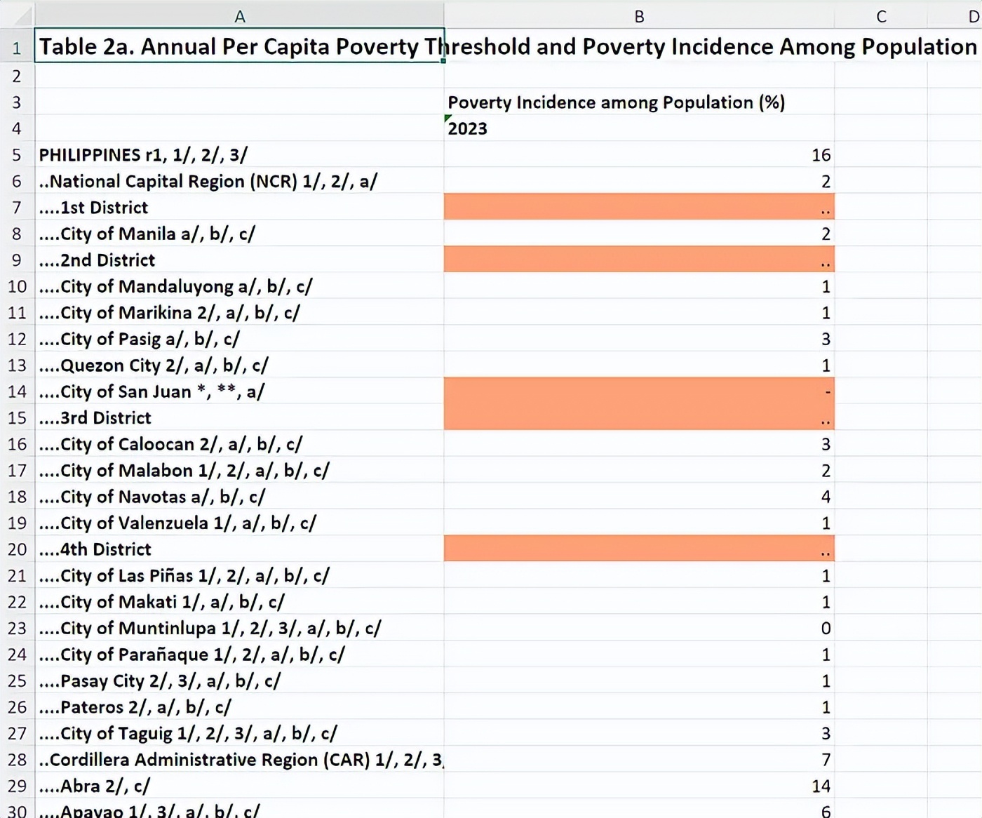
An Excel spreadsheet displaying the poverty threshold data in the Philippines.
I instructed Claude Code to extract the data and insert it into our template map. Since it only contained data up to the provincial level, I had the programming agent simply disable the drill-down functionality.
It worked like magic—no tedious data cleaning or transformation needed. It even figured out the hierarchical levels represented in the spreadsheet and imported the data accordingly. A spot check of the imported data in the map panel showed it accurately extracted everything. I only needed Claude Code to adjust some display details. For example, unlike other regions in the country, the National Capital Region contains cities and municipalities instead of provinces, so the map had to reflect this.
The drill-down map of poverty incidence in the Philippines based on the PSA spreadsheet.
I tried other datasets I could find—annual household income, Gini coefficient, GDP by region—and it handled them all well. Impressive.
3. Exploration
Programming agents make it easy to pivot and pursue new ideas.
At that point, I stumbled upon the NDHS dataset. Unlike other spreadsheets, this one was more complex, with multiple worksheets and other indicators beyond geography. I had Claude Code extract geographical data from one sheet and build the map—total fertility rate—and it did so perfectly.
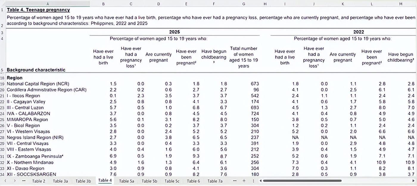
A table showing adolescent pregnancy data from the 2025 Philippines National Demographic and Health Survey.
Building maps from other worksheets wasn’t as straightforward. For example, the adolescent pregnancy table had five different dimensions. I had Claude Code create a tagging system to let users navigate these dimensions, and it nailed it in one go. After building five additional maps from the dataset, I realized I could pivot to turn it into a dedicated dashboard focusing on the NDHS survey.
I launched another new project in Claude Code for the NDHS dataset. After reviewing the data in the report, I realized that the project would be richer if I could also display other indicators in addition to the maps.
So I had it create another tagging system, this time to let users navigate to pages with other non-geographical charts. Then I instructed it to extract non-geographical data from each worksheet and render them into charts.
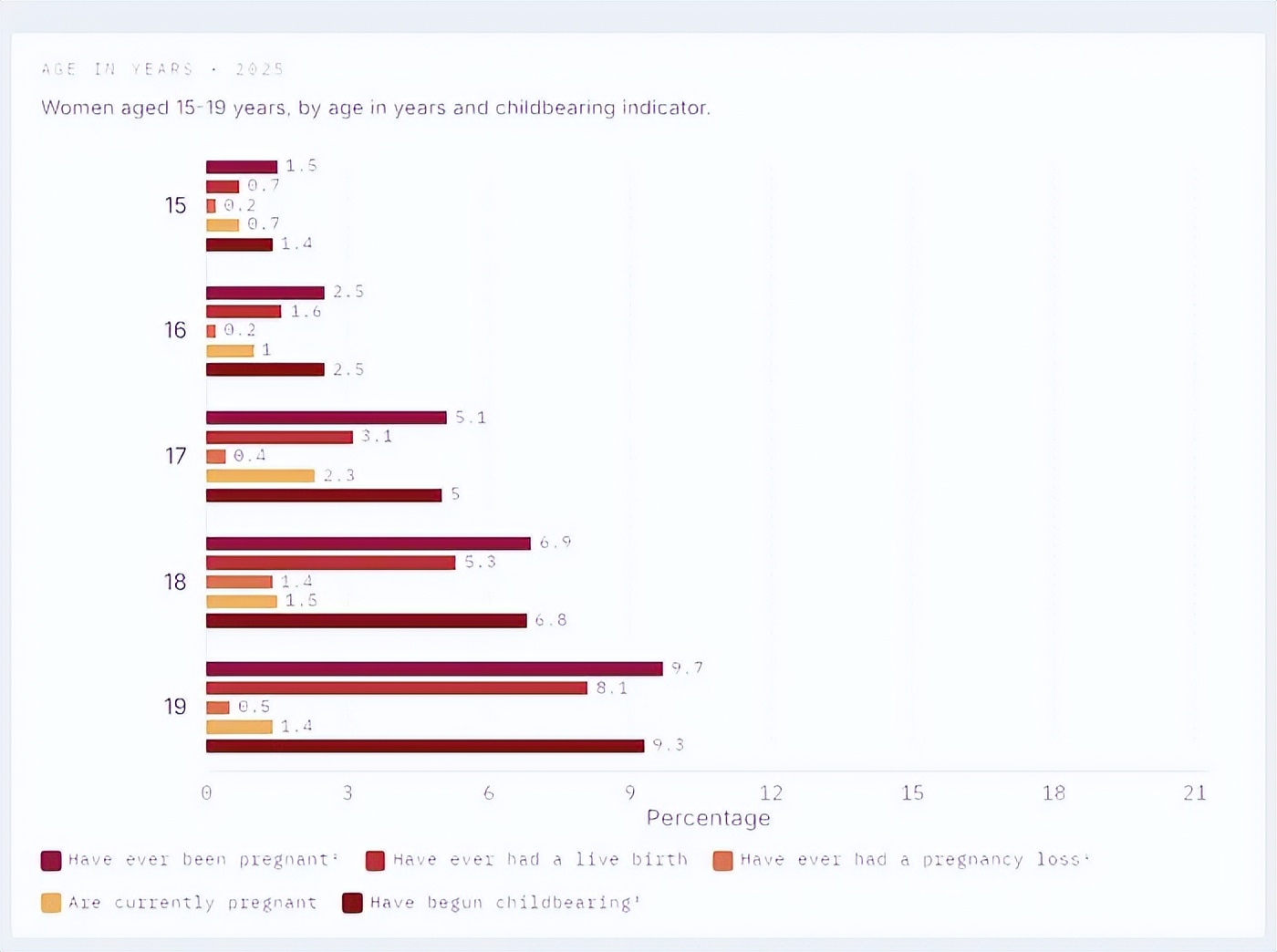
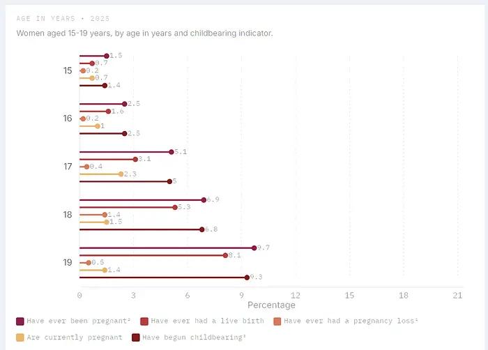
A pair of charts displaying adolescent pregnancy data from the NDHS, one as a bar chart and the other as a lollipop chart.
Even for design choices, pivoting was easy. Realizing I wanted the charts to be lollipop charts instead of bar charts because I thought they looked cleaner, and because of the feel, I just needed one instruction, and the programming agent changed everything. Speaking of which…
4. Iteration
You need to continuously make editorial and design choices.
If I could hand the entire spreadsheet to the programming agent and let it work its magic, this article would be much shorter, but that’s not the case. Of course, my training as a journalist requires me to check each time a map or chart is generated to ensure it accurately imported the data.
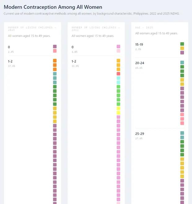
But the nature of the dataset also necessitated making decisions that impacted the editorial and design direction of the project. For example, the data on female contraceptive preferences contained 16 different dimensions. If I just put it all on the dashboard, the navigation experience would be terrible. So I decided to split that specific table into three different parts: one page for contraceptive use (showing classifications for users of any method, any modern method, any traditional method, and non-users), one page for modern contraceptives (breaking down different methods used), and one page for traditional contraceptives.
The programming agent’s first attempt at rendering a waffle chart based on NDHS data.
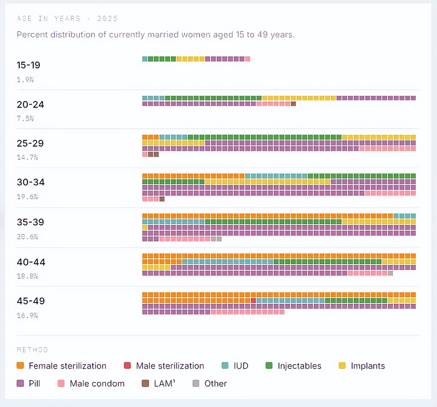
The correct waffle chart, showing Filipino women’s preferences for modern contraceptive methods based on NDHS data.
I also needed to find an elegant way to visualize this data in the charts—grouped lollipop charts were simply not suitable for a dataset with so many dimensions. I decided to try using waffle charts, which worked well in displaying the distribution of data across all these dimensions, but it required some iteration to get the programming agent to fully understand what I wanted.
I made similar editorial decisions regarding vaccination data, all of which was concentrated in one worksheet in the original dataset but ultimately spread across five different pages in the dashboard.
These design and editorial decisions also affected the programming agent in other ways. For instance, when I extracted the entire worksheet, it directly used the description of that worksheet. But when I split that worksheet into different pages, the programming agent would guess the description for the data on that page. Besides needing to check for accuracy, I also had to ensure that the style and length of the descriptions remained consistent across different pages.
Most of the other work involved ensuring small details worked correctly. In most cases, the programming agent accurately imported the data, but sometimes it would miss things like table annotations, which I had to catch. I had to check if the charts rendered well on mobile (initially they did not; I had to request size increases multiple times until I was satisfied), whether the lollipops were drawn too close to the axis labels, and whether the data labels were too close to the lollipop heads. I had to request that national averages be added to the data panels of each map, and only after that did I place them above the regional ranking lists.
As a former editor who used to lead major data visualization projects, this experience felt like collaborating with graphic designers and web developers, providing them feedback to adjust everything. Only this time, since I was the only human participant, there was no risk of exhausting colleagues in endless rounds of modifications and revisions.
5. Architecture
Vibe can take you far, but ultimately you need to think about architecture.
While AI programming agents do not get tired, they still impose usage limits that can halt your work. Because of my endless modification requests, I would quickly run out of usage. Since I subscribed to Claude Pro and ChatGPT Plus, I wondered if one programming agent could pick up where another left off.
It turned out they could. I was even lazy about handling memory-related issues—I just copied the latest CLAUDE.md into AGENTS.md (and vice versa), and the programming agents figured it out, allowing me to continue vibe coding.
Of course, all of this was fun until you lift the hood and find that the programming agents have made a mess inside. In my case, when trying to debug one element, I discovered why updates weren’t reflecting on the frontend: one of the pages had two map renderers. When the agent updated one renderer, the server provided the other.
This prompted me to start thinking more seriously about the architecture of the project. I wasn’t starting from scratch since the agents had already done a lot of work. After understanding what they had done, I standardized everything into a simple architecture:
Presentation Layer. I had Codex create standard blank templates for maps, charts (lollipops and waffles), and data tables. I should have prepared these templates from the beginning, as they allowed me to quickly check the accuracy of data extraction and provided users with a more transparent way to verify the source of the data. Later, I added another section for AI-generated insights. Whenever I created a new data page, the programming agent just needed to copy the template and customize it based on the available data. After completing these, I had the programming agent standardize all pages according to the templates.
Extraction Layer. For each page on the dashboard, the programming agent wrote a script to extract data from the original spreadsheet and save it to a JSON file. This means that if an error is found in the data extraction, the programming agent just needs to patch the extraction script, rerun it, and update the data on the dashboard. When I implemented this architecture, most but not all existing pages already had this.
Data Layer. Each page has a data.json file that serves as the handoff between extraction and presentation. It stores the structured content for that page (map values, chart blocks, table blocks, annotations, and insights), allowing the UI to remain reusable while the data remains page-specific. Before I implemented this, a few pages still had data written directly into the HTML files.
This structure made the programming agents more efficient in several ways. Because they primarily patched existing scripts and files, there was no need to generate a lot of code from scratch, reducing token usage. Standard templates also made updates easier to implement since the same patterns were reused across pages. The independent data layer helped with debugging, making it easier to determine whether the issue was in the rendering code or the extracted data. Nevertheless, there were still many inconsistencies between pages that might need to be refactored at some point to make them more maintainable and scalable.
Speaking of more efficient agents, I found that using older models—in this case, GPT-5.3-codex medium on Codex—was more economical in terms of usage while still being good enough to get the project across the finish line. I ended up using Codex for most of the project, only using Claude Code in the remaining parts to debug a few things.
6. Value
AI-generated insights can add significant value to data projects.
I wanted to experiment with using AI to generate insights from the data. To do this, I went through a two-step process. I had the programming agent generate a prompt and save it to the prompt library. Then I reviewed the prompt before running the agent. The output was then stored and inserted into the data pages.
There were several reasons for this. I wanted to be able to manually review and edit the prompts before running them, and check the outputs separately to see if the prompts were effective. Once, when generating insights about adolescent pregnancy, the AI announced its major finding: 19-year-olds are more likely to get pregnant than 15-year-olds. This was certainly accurate, but it was hard to say it was a breakthrough insight that the agent thought it had discovered. The prompts needed further modification.
Generating prompts for review also helps prevent overfitting, where the agent has already included its analysis of the data in the instructions, preventing it from finding more insightful patterns. It also allowed me to use well-performing prompts as templates, saving token usage again.
The insights themselves are very valuable in presenting information that is difficult to glean from maps, charts, and data tables. Take a look at this excerpt from the AI-generated insights on intimate partner violence: “The high headline numbers in the regions are not composed the same way. Caraga combines very high emotional violence (21.8) with higher physical violence (6.8) and sexual violence (3.7). The Bicol region is high in all three major components, including 9.1 for physical violence. The Central Luzon region’s 20.5 headline number is primarily driven by emotional violence (18.9), relative to lower sexual violence (2.1).”
7. Guardrails
Fact-checking workflows can aid the auditing process but require strong guardrails.
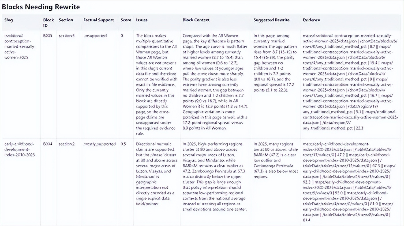
The report from the fact-checking sub-agent, marking several issues while displaying the data that supported the ratings.
Of course, whenever journalists face any AI-generated content, the first question that comes to mind is: Is it accurate?
To address this, I built a fact-checking workflow into the programming agent to cross-reference the insights against the data. Initially, the fact-checking agent would extract individual claims, verify them, and suggest rewrites. But checking claims in isolation often stripped away the context already present in the same insight block, making rewrites repetitive.
I then pivoted to block-level fact-checking, where each insight block was checked against the data as a whole. Each block was rated as supported, mostly supported, partially supported, or unsupported. Only blocks that were not fully supported needed rewrites; fully supported blocks remained unchanged.
In practice, this was still not enough. As the runs grew longer, the agents tended to take shortcuts: they would reuse familiar evidence patterns, cite nearby but incorrect values, or point to fields that looked correct but did not match the source cell exactly. The output might sound convincing but could still be wrong.
So I added stricter guardrails. Each evidence line had to point to an exact data pointer and precise value, and the verification script checked the structural validity and quality of the evidence before accepting the results. Failed outputs were rejected and rerun. This turned the process into a stricter auditing pipeline rather than a one-time AI check.
For each insights page, the fact-checking agent generated a scoring report that not only displayed the ratings but also showed the data points it based its judgments on. It also provided explanations for the “mostly supported,” “partially supported,” and “unsupported” ratings. Ultimately, the fact-checking workflow checked 273 blocks, finding that 258 were supported, 12 mostly supported, 2 partially supported, and 1 unsupported.
While it is still not a perfect newsroom tool, this made the manual checking process easier, as the report quickly highlighted which claims were directly supported by data, which needed closer reading, and which needed rewriting or removal. If I were to do it again, I would run the fact-checker immediately after generating the insights, making it easier to check at a page level rather than handling 273 large blocks all at once.
The fact-checking agent can make auditing AI-generated writing more reliable, but strong guardrails are needed to ensure everything is structured, repeatable, and traceable back to the source data.
8. Pioneers
Early testers immediately saw the practical value.
Stakeholders who tested the dashboard immediately recognized its potential value for their work.
Romelei Camiling-Alfonso, a doctor and health innovation expert, said the dashboard would be useful for provincial health officials, city health officers, and members of the “rural doctor” program, which deploys doctors to underserved and remote communities to provide primary healthcare services.
Athena Presto, a sociologist researching gender and policy at the Australian National University, said the project made the survey data immediately understandable without looking at the numbers. “I think a low-sensory-demand website is great for those who just want to quickly glance and immediately need information,” she said.
Tricia Aquino, co-founder and content director of Pumapodcast, who previously reported on the NDHS, expressed excitement about the potential for collaboration between newsrooms based on the dashboard data and insights. “This project makes it much easier to view, interact with, and analyze the data. Finding patterns and connections is also easier,” she said. “There are a lot of AI-generated insights that can serve as starting points for reporting across the country, and I can imagine newsrooms collaborating across regions to present local findings that can influence policy.”
9. The Possibilities Are Just Beginning
A natural next step is to build regional cross-reports that summarize all NDHS data for each region. This would be particularly useful for policymakers, journalists, and advocates who are less focused on national patterns and more on what the numbers mean for their specific regions.
Another possibility is to overlay a chatbot on the dashboard. Users wouldn’t have to navigate through maps and charts to find answers; they could directly ask, “Which region has the highest unmet need for family planning?” and receive direct, data-based answers. The infrastructure for this already exists in the way the data is structured; it’s mainly about building the right interface on top of it. Of course, this would also require a built-in fact-checking layer.
The dashboard could also be enriched by adding additional datasets from the PSA and other sources. The NDHS data itself is insightful, but it becomes more powerful when combined with other indicators like poverty incidence, regional GDP, or access to healthcare facilities. Cross-referencing these could uncover connections that a single dataset cannot reveal.
Perhaps the most exciting possibility is that the entire dashboard—maps, charts, AI-generated insights, and the fact-checking pipeline—was built by one person in a week.
Vibe coding made this possible. But as this project also demonstrates, vibe alone is not enough. The industry now needs to figure out how to train journalists and newsroom staff to actually build things, giving them sufficient architecture and data understanding to achieve their goals while keeping them firmly rooted in editorial judgment.
Comments
Discussion is powered by Giscus (GitHub Discussions). Add
repo,repoID,category, andcategoryIDunder[params.comments.giscus]inhugo.tomlusing the values from the Giscus setup tool.